Life presented other priorities for many Photo Devotos this year; not so for Kelly Stachura (luckily for the rest of us). Check out her mammoth undertaking, and the fine result, at http://www.sofobomo.org/book-418-Direction-Abandon-miss-GUIDED.
Ah, Summer: “summer reading”… darkroom tans… cool exhibition spaces…
It’s time for you to make your own field trip with a coupla BFFs. Go see some actual art: it’s there on display for your delectation. Be whelmed, such that you experience a physical reaction, causing you take a sudden breath (i.e. get inspired).

Downtown, the Cultural Center has the work by Gene Smith that you’ve seen in the Jazz Loft book. There’s audio and video in addition to Smith’s spectacular prints, and many prisine little work prints with tiny borders–a good example for all of us. Elsewhere in the building you can see a terrific collection of illustrations and remnants of Louis Sullivan architecure. Then hop over to the ‘tute for an exhibit also based on Sullivan, including work by Aaron Siskind, John Szarkowski and St. Richard Nickel.

In River North, Catherine Edelman has mounted a show about contact sheets entitled “Proof,” demonstrating editing and selection; Schneider Gallery has a lovely group show as well.
Then (or on another day, as a separate trip), get on up/over to Evanston: the Noyes Cultural Center has Kay Westhues’s work, made mostly in Indiana;

Dittmar Gallery in the Norris Center at Northwestern has Stephanie Dean’s “Modern Groceries”

(call before you go to Norris [847-491-2300], because parking can be problematic);
and the very excellent Paul Clark is showing at Perspective Group and Photography Gallery, 1310-1/2B Chicago Avenue.

Oh, there is more, but W/B about what you like among these, and I’ll pass it along.
A Massive Exhibit from Sotheby’s and Polaroid

Watch this little promotional video, then consider a road trip to New York next weekend:


An opportunity to see work of this scope may not occur again in a lifetime. (The fact that the Type 55 film used by St. Ansel for a trio of different-size prints was in fact Kodak’s Panatomic-X in a Polaroid product does not in any way diminish Adams’s achievement.)


The 63-print mosaic is SX-70 prints, spat out from a hand-held camera (as is the Warhol self-portrait at the top; the nine unique prints that make Chuck Close’s self-portrait are each 20×24 inches, as are the Wegman Weimeraners.
UPDATE: Even though this was a court-ordered dispersal of collateral, it comprised only 1% of Polaroid’s collection.
Nuance Night & The Big Art Show

Get thy gluteus maximus to Nuance Night, the launch party for Barrington Huge School’s annual literary & art magazine! It’s a physical object you can hold in your hand, as opposed to some cyber entity that may or may not exist.
There’ll be music, and food, and Hot Guys From Other Schools (maybe that’s a stretch). Nuance is a limited issue item, so plan on acquiring one while you can. You’ll never regret doing so.
The event takes place in the GRC on Tuesday from 6:30 to 8:30. Show up; get your copy autographed by the published artists!
Whilst in the building, savor (for the last time) the excellent annual all-school art show as well. The exhibit will disintegrate significantly on Wednesday.
Bonus Karma
Here are the first trans-submissions to the NYT’s “Moment’ project:


http://submit.nytimes.com/moment is your link to the Times’s project, but don’t wait, and e-mail me your files at the same time. (Picture credits are forthcoming.)
One-Shot Bonus Karma on May 2
“Extra credit” is such a hackneyed phrase, n’est-pas? We tend to forget that it refers to stuff “over and beyond” what’s required (as opposed to “in place of”). Despite and still, there are some singletons coming up in the Wonderful World of Photography:
http://lens.blogs.nytimes.com/2010/04/08/about-3/
AND… upload your one, ideal picture here at the same time to earn your “Bonus Karma.” (Actually, I don’t know if you can leave a .jpg as a comment, so send it to jdionesotes@prodigy.net and I’ll transfer it.)
Read the Times’s post very carefully, so that everyone is on the same page. You may or may not want to shoot something that also fits into a current project in class, or into your portfolio.
We Review

Dozens of Ph.Ds rode the rails to River North today, another perfect day in the Perfect City, to look at the effects of light on sensitized surfaces. Herewith, be nourished and piqued by these observations:
Ann Marie: “The photographer I found most inspiring today was Keith Carter, I think his work is meant to evoke memories or things you’ve previously imagined. His photos have an amazing ethereal and airy quality about them that makes you take notice and find your own meaning in them. I don’t want to say you get lost in the images, rather, your mind becomes extremely involved with it, almost creating your own alternate universe or back story. Some artists may feel limited only using one medium, but I feel that Carter is able to manipulate and tweak the process in a unique way that is completely appropriate.
The artist whose work I thought was most relevant to mine was Kevin Malella. Not that my work can even compare to his, it’s just that I noticed in his landscapes that there’s a repetition of shapes that reminds me of the geometric patterns in my photos. I think this work is perceived more elegantly than my own because of his attention to detail and composition, which I find engaging and individual.”
Emma: “The work we viewed today that I enjoyed most was that of Guillermo Srodek-Hart. His use of lighting, along with his tricky method of making it look like such pleasing light was coming from fluorescents, helped to better show off his eclectic subject matter. Speaking of the subject matter, this component of his work is what makes it eye-catching. Photographing generally disorganized little shops filled with random items helps the pictures to keep attention for longer than the average piece. Looking at these prints is like playing a game of I-Spy, trying to see what one can find on the lopsided shelves. The fact that these prints were in color definitely added to the overall effect, distinguishing between objects and adding to the mish-mashed quality of the photos.
While this particular artist’s work isn’t particular relevant to mine, I aspire to it. The artist whose work is most relevant to my own would be Keith Carter, mostly due to the fact that it is black and white and of smaller size than the other artists we viewed. His attention to the making of the print is pretty darn impressive and very intentional.”
Kalah: “On our trip today, I found one photographer, not on our list, that stuck in my mind all day. Lauren E. Simonutti’s work was, for me, memorable. I saw many elements of her photography as something I would strive for. In “The Devil’s Alphabet,” there is a darkness that makes you feel both intruiged and haunted. Most of the prints had tight framing, and that in itself was powerful because you are forced to look at every line, shape, and body part that might appear. I also enjoyed the rawness she brought. She was able to capture a state of mind that leaves the viewer interested in the meaning behind the print. I think what she was trying to show through these photographs is a helpless and gothic state of mind. That is where the rawness comes in. Being helpless and changing is putting yourself out there, and I think she did achieve that. Her use of line and angle are other elements that drew me in because you, again, have to look harder to determine a meaning behind them. The photograph, “Hollow,” was a favorite of mine (check it out!) because of the specific use of line and angle.
Another photographer i found interesting was Kevin Malella. His work was interesting becasue he achieved a specific emotion with each piece. That both impressed me and surprised me. When I first saw his work, i was very close, and I did not get much from it. As i backed away, I found i enjoyed it more because, as a panaramic piece, I could take it all in. “The Docks” put his work in view for me, because it automatically caught my eye and gave me that feeling of a cold, early winter morning. The lines, which seemed to be evident in many of his pieces in the gallery, set up a path to follow to be able to focus on more of the piece rather than in sections.”


All in all, a wonderful day in the city!” http://www.edelmangallery.com/exhibitions/2010/simonutti/simonuttishow2009_DA.htm
Brennan: “Keith Carter’s super low apertures really lit up my day today. He has something he is set on showing you and it is all in the small details that lie in focus. A simple image is made abstract when put almost entirely out of focus, and it allows the viewer’s mind to wander and think about what might be going on in the image. His portrayal of people seems to be in the actual moment it occurred, which makes you feel like you got a lucky glimpse of the action. Most of his images were printed full frame and it is nice to see that because it shows you how important framing the scene is before you take the picture. What makes this work more elegant than some of our own is that, though the images look spontaneous, they also feel very planned out, as though they were perceived before he took them.
Guillermo Srodek-Hart’s images had really outstanding lighting, especially considering most of them were taken indoors. The images were packed with objects and it almost feels like they attack you but the best kind of attack where everyone is excited and no one gets hurt.”
Susan: “The simplicity, yet extreme depth to Keith Carter’s work really stood out to me. I was able to see the captured the joys and hardships of human life within his photographs. I particularly was drawn to the provocative nature of each image and the story that could be told through the piece. He prints in a way that the black and white doesn’t drown out the happiness of the image, if that’s what it is meant to portray.
Shooting, I try to find simple things in life in order to capture things people might pass up or not notice. This is incredibly present in Keith Carter’s work as well as Guillermo Srodek-Hart’s work and Kevin Malella. Any of my work is not even comparable to these artists. I admire their abilities. Each of the photographers we looked at were able to maintain elements and principles of design though continue to do work that they wish and remain inspiring to others.”

Zach: “Each photographer we saw showed what they wanted to portray to the viewer in a great way. It was clear what each artist was focusing on, and in that choice they also made each piece stand out from another, yet they all flowed so well as a whole. Photographer Keith Carter caught my eye more than the others, as I think he did for pretty much everyone on the trip. Not to say the others are bad, I just think he was more relatable to the work of most people in the class. His work is not very relevant to my own, but the way he has a lot of things in and out of focus I think is something I notice in many of my pictures, and definitely something I want to work more towards. It’s very appealing for me to show various emotions. Keith’s work is by far more elegant than my own; myself, I am still not sure what exactly I am working towards, which makes it challenging shooting because I am not always trying to get one object, person, reason, or point of view across. In his work, he shows such strong passion and love in what he does, and pinpoints exactly his themes and ideas, making everything easy to understand and perceive.”

Kulsoom: “Keith Carter’s photographs from “Seen and Unseen” tested the limits of a photographer’s talents by allowing focus to be used as an illusion. What cannot be seen in these photographs is exactly what Carter didn’t want us to see. The intention is clearly shown and the process is not hidden. The photograph that most caught my eye was “Equestrienne”. This particular photograph had the ability to create wonder in each person who came across it. Each photograph in the series has a “seen and unseen” element. This one focuses on the eyes of what appears to be a young girl. Her eyes are cold and familiar, which makes this piece so impactful. The rest of the image is mostly distorted, but you catch yourself staring into her eyes, those that seem to follow you. Her emotionless expression, from what can be seen, further draws you into what her world may be like.”
Maggie: “Keith Carter’s work in “Seen and Unseen” combined both great concept and great execution (expected, if you are showing in galleries). There was always deep contrast in his pieces. Conceptually, the photos created scenes of contrast. An example of this was the photo of the old African-American man, who was rough and tired, with the young and delicate kittens. This was my favorite of the collection. He also stylized with great contrast by either using a specific focus surrounded by blur or deep blacks next to bright whites. The use of B/W was very appropriate in my opinion. B/W allows the viewer to focus on shape and composition.”
(Refer to https://photodevoto.wordpress.com/2010/04/08/where-were-going/ in order to see some of the work mentioned.)
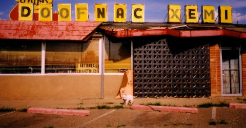
(Cellphone pic, atop, by S. Pappas)
Where We’re Going
On April 15, taxes behind us, next year’s Varsity Photo class (and most of this year’s roster) will travel via rail to the City of Big Tripods to see original work on exhibit. These jpegs on your screen just don’t cut it; the original prints will be seen as they were intended to be seen.

Guillermo Srodek-Hart

Kevin Malella

Karen Savage

Eugene Richards

Jon Fjortoft
Actual Works
Last night’s reception for the seniors’ AP Art Show was perhaps the best ever. Many of the exhibiting artists hosted, and realized that this activity releases endorphins, too (not unlike making new negatives). All the gourmet food went, and three or four generations of friends and relatives oohed & aahed. More snapshots were taken than there are pieces on display; here are a couple three:


We Love Our Work

April is the coolest month. Here are all of the important dates I can think of at the moment:
3/29 The darkroom is available from 6:00 to 8:30. Sam Thorne perfects time travel.
3/30 Your field trip form is due, signed by all, with $6.00 for the Yellow Safety Bus; we hang the AP Seniors exhibit.
3/31 Your field trip form is due, signed by all, with $6.00 for the Yellow Safety Bus; we tweak the exhibit.
4/1 Your field trip form is due, signed by all, with $6.00 for the Yellow Safety Bus; AP exhibit reception, 6:00-7:30.

You should host your own reception, and invite others to share in the celebration (at least one adult and one peer).
4/2 Classes are not in session.
4/8 We embark on the last en masse shooting trip of the year.
4/12 7th hour, the class meets in a library computer classroom in order to set up College Board accounts online.
4/13 We make up the aforementioned expedition if it was postponed due to acid rain.
4/15 Those of you who can spare the time away from class join next year’s class members on a trip (via RR) to galleries in and around downtown.

