Rock On Paper

390789_10150507734692323_559977322_10580700_1191560046_n

Come, one and all, to the reception for Nate Azark at the Clair-y Smith Gallery Gallera. It’s this Thursday evening (January 31) from 6:30 to 8:00.
384706_10150507735612323_559977322_10580704_1958126883_n

Scheduled to appear:

buds

nesmith

971591236873901

moptops

Anself

garth-brooks

Marvin Gaye Holding a Sign with His Name

486253_10151114446602323_50482759_n

The exhibit of concert posters and photographs continues through February 14. https://www.facebook.com/home.php#!/events/198337356971651/

Recent Sightings

61393_4626923025104_1340844583_n

487233_4756119658330_1830408719_n

If you have any contributions to this body of work, feel free to contribute.

W. o’ W.: Nagisa Oshima

in_the_realm2

“Nothing that is expressed is obscene. What is obscene is what is hidden.”

3 oshima

W. o’ W.: Bob Thall, Part Two

Thall1996_274

“Any attempt to describe a place is a complicated balancing act for a photographer. First are concerns of fairness, objectivity, and documentary completeness. If one goes too far in the direction of documentation, however, the project becomes an assemblage of new visual facts, the photographs mere illustrations in a catalog of items. Doing this type of work, one tries to create photographs that have integrity, beauty, and resonance as new objects, not just as records. Too much concern with form, though, risk losing the photograph’s connection with the real world. Furthermore, one wants to communicate personal insights. This type of photography, like all art, is most engaging as a statement of opinion, bias, and belief. On the other hand the photographer must be concerned that too much of his or her opinion does not cause the viewer to suspect that the photographs are unreliable, that the photographer has stacked the deck.

BobThall_X470UY258C

“These contradictory concerns, even the very terms “art” and “documentary,” can drive a photographer to distraction. Over many years, I’ve learned to fight this confusion and get down to productive work by thinking of my job in a simple, reductive way. I select a place and spend as much time as possible there, even years, walking and driving and looking for photographs. Initially it’s a haphazard way to come to know an area, but slowly the place reveals itself and I begin to understand what I find most interesting and important. I then try to make pictures, straightforward and factual–looking photographs that distill and exaggerate those aspects.”

“Concealed Behind The More Conventional Thing”

105988_555256

http://prosedoctor.blogspot.com/2013/01/finding-what-you-werent-looking-for.html

BlowUp

Apply For The Advanced Placement 2-D Studio Course

NEXT YEAR’S JUNIORS SENIORS:

Apply for

ADVANCED PLACEMENT

Art Studio Courses


*2-D Design*

*3-D Design*

*Drawing & Painting*


Submit a small portfolio:

5-8 best examples of your work,

along with sketchbooks, 

by WEDNESDAY, February 13th (Drawing & Painting, February 6th).


Questions? Ask the nearest Art teacher.

Mural Art In Public Schools

wauwato2

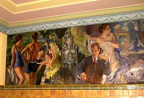
Myron Nutting was commissioned in June 1934 to design and paint the Wauwatosa High School murals in the school’s art-deco style front lobby. Lincoln Cleveland

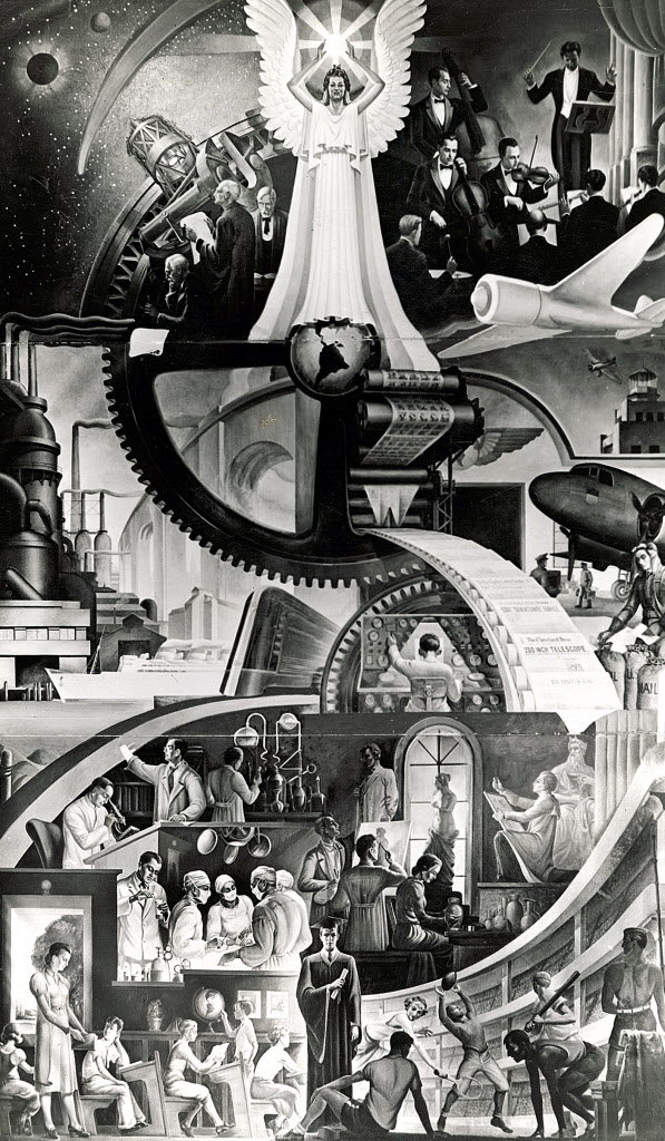
Anyone who stood by the railing at the well between classes will remember the three-story high mural “Spirit of Education,” the WPA mural, in the main entrance hallway of Lincoln High School in the Cleveland Municipal School District. The mural is now a cultural and historical memorial which was painted specifically for the school in 1939 by artist, William Krusoe.

FerringMuralDubuque

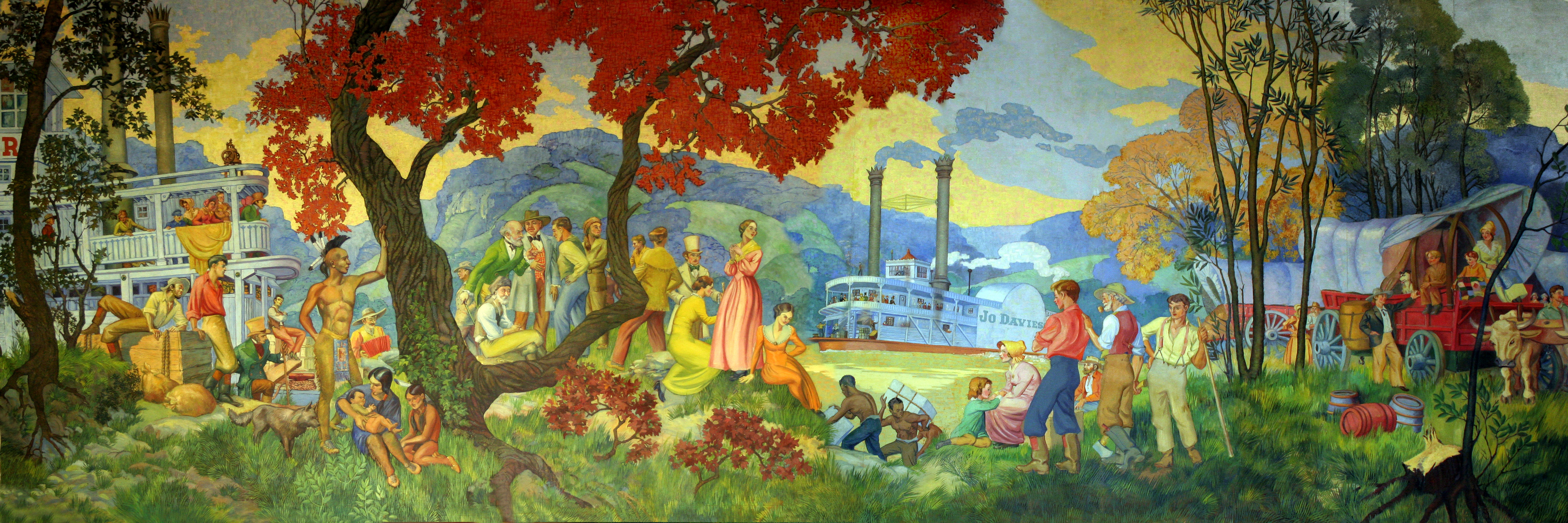
The large mural on the east wall of Dubuque’s Senior High School was painted by Cyrus Ferring in his spare time, the necessary expense borne by the student fund, and is a gift from Mr. Ferring to the school. It was hung in its present location in the summer of 1935.

IMG_6882

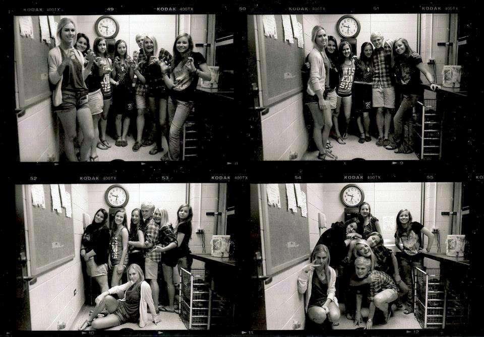
This appeared, unannounced, over winter break in January 2013, filling some available space above the already-busy entry wall of Barrington Huge School. Rotating displays concerning student activities (occasionally giving way to student art), sit next to a patriotic collage hung over the shoulders of the reception desk attendant.

Rather than taking the allegorical approach used by many artists commissioned in times of financial uncertainty, the new piece consists of politically-correct buzzwords partially obscured by reproductions of yearbook-style photographs, each representing a decade of this particular school’s history; current logotypes used on district and school stationery; and the district’s “motto,” written in the style of other nearby districts. The application of spot color in the monochromatic reproductions, popular in 1980s television commercials and used sparingly (once) in a 186-minute Stephen Spielberg film twenty years ago, is employed no fewer than five times, apparently in an effort to unify the images. The designer is anonymous (design may have been by committee).

Malleable Work Flow

Last Saturday I developed a roll of film I’d labelled “7+7.” I couldn’t remember what that meant; this happens often (cryptic labeling, or forgetting? both, actually). It was group portraits of the AP class in May, and the clock reminds us that these exposures were made in the final moments of the exam period.


150694_10200312924054166_1824697934_n

Lauren made a proof sheet and Nikki took it home overnight; I obtained this image this morning from Sam’s Facebook page (!).


Yow.


Tribune-GOB-1

Who’d-a thunk it?

“A word to the wise is sufficient.” -Alfred Stieglitz


Separated At Birth?

This

portrait of Alec Soth

…plus this…

ira-glass-los-angeles

equals this: http://vimeo.com/49527820

Alec Soth (“rhymes with both”) being serious, outdoors, with furniture.