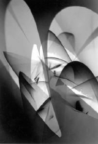
John Cyr’s Respect; or, Hand-me-downs

Jock Sturges uses Paul Strand’s contact printing frame; someone now has Joel-Peter Witkin’s enlarger. We have darkroom parts from Mrs. D.’s uncle, and some of you have, or will use, equipment from the homes of BHS alumni.

http://vimeo.com/43289528

http://www.edelmangallery.com/exhibitions/2012/installed/installed.htm

Community Darkrooms in Chicagoland

Good news! This place opened in May. It’s a few feet from the Kennedy, just before downtown, a great location: http://chicagocommunitydarkroom.org/

This  is the only one of the places listed here that I’ve seen: http://www.norris.northwestern.edu/recreation/artica/ It’s in the Norris Center on Northwestern’s campus in Evanston (right below the cafeteria!), and parking is problematic (but I can explicate it for you). For everyone’s benefit and safety, one takes a short quiz the first time, so they know that you know what you’re doing.

These are located in Park District fieldhouses: http://www.chicagoartistsresource.org/visual-arts/node/8398 The practical ones for you to consider are the 2nd and the 4th.

(I came across a nice older apartment building for students near Loyola that features studio space, rehearsal space, and darkroom space, but upon further investigation the word “bedbugs” appeared. ‘Nuff said.) (As well, many of the rehearsals were scheduled in mid-night.)

If you are aware of a darkroom on your campus, especially if your major is not Photography or any sort of art, please let us know about it so we can spread the word. Also, the offer still stands: all the technical information you need in order to set up or restore a campus/dorm darkroom is yours for the asking.

Work in Progess/Process

Not that anyone’s on tenterhooks, but some negatives are made, and what remains is what has been called the “photo-finishing.”

As a further preview, here’s a little sample ‘shopping:

Yep.

You don’t have to abandon the process you enjoy

In response to this week’s alarmist articles about film’s allegedly imminent demise, Blake Andrews posted on his blawwg: “I must live in some film bubble timewarp because virtually every photographer I know in Portland still shoots film. My photogroup Lightleak has eight to twelve members depending on what month it is and who shows up, and every one of us is a film shooter.”

If you have asked about this, or paid attention to conversations and posts, you already know that most of the following is reasonable. Nonetheless, this article by Ctein…

…makes long-term planning clearer: http://theonlinephotographer.typepad.com/the_online_photographer/2011/06/film-photography-future.html

Multigrade Art 300: The Final Product

The following is gleaned from an e-newsletter (is that a word?) from Tim Rudman. Look him up (timrudman.com) and subscribe, if this kind of information interests you:

There have been a few emulsion adjustments since the pre-launch product, and more information about the product has been made available. The first impression was that the emulsion was a variant of MGWT but in fact it is a “sibling” of MGIV, and is neutral- rather than warm-toned. The base is described as neutral to cool tone, but in fact is very subtly warm if compared to the back, or to MGWT, or a truly white base like Fomatone MG Classic used to be. This gives the emulsion a slightly warm, rather than neutral, look in the higher tones. No pigment is added to the base, which is whiter before coating, but the modified process required to coat this art base seems to add this very slight warmth to it. Side-by-side testing with MGWT shows an almost identical speed, so analyser settings for MGWT will work pretty well. The final product also has very slightly brighter highlights and “better” tonal separation in the upper tones too.

The other pleasant surprise was that it gave rich browns in selenium, which the test sample did not. Fairly strong selenium at 1+5 gave rich chocolate brown, and a clear brown-grey split was easily achieved if desired. Strength for strength the Harman selenium gave richer colour than Kodak selenium.

“What filter?”

According to Mr. Shore, “The tonal range of a black-and-white print is affected by the type of emulsion the print is made with. The composition of the film emulsion, the chemistry of the film and print developers, and the nature of the light source from which the print is made also determine the way shadows, mid tones, and highlights are described by the print; they determine how many shades of gray the print contains and whether these tones are compressed or separated.”

According to moi, each negative is a matrix, with a range of tones determined by the photographed scene, its quality of light, the film exposure and degree of development. In most cases all one wants to do is to extract as much as possible to the paper so that the image looks… believable.

Filters are numbered from 00 to 5, with half-steps in between (‘cept there ain’t no #00 1/2; a blessing in disguise, perhaps). Their colors cause different layers of emulsion on the paper to respond to different degrees. For some reason the #2 (or #2-1/2) filter is considered “normal,” pretty much how the paper responds without a filter, only faster. (The same is true of graded paper, which comes in packages of single grades and does not respond to filters.) When we adjust contrast whilst printing we are attempting to make the image look well. Think of it as counterbalancing the contrast set in the negative with a contrast level in the paper.

Generally, a negative with an overall extreme range of tones built into the scene (early-morning, raking light, snow in sunlight, silhouettes) will require a lower numbered filter, and a negative with relatively little range (gloomy days, dusk, fluorescent/ill-lit interiors, underexposed or underdeveloped film) needs a higher one.

Photograms

A few of us are currently inspiring others in our midst by dabbling in photograms. This process is basic; it seems retro at times, which actually kind of guarantees that it will never “go away;” some value it for its subtlety, some for its potential for simplicity and scale. Here is an exhibit that informs current good work: http://1000wordsphotographymagazine.blogspot.com/2011/02/shadow-catchers-camera-less-photography.html

No technology ever dies. Some keep getting better, too.

http://www.amateurphotographer.co.uk/news/Photographers_get_first_Ilford_darkroom_paper_in_13_years_news_305572.html

Solarization

I thought I had posted this over a year ago. Apparently, I was mistaken.

Voila.

Solarization is a style of print exposure and development whose appearance is markedly different from “normal” photographic representation. Unlike such strategies as negative prints or the use of camera lens filters, the resulting print is a unique distortion of the tonal scale that does not appear to conform to that of the original scene.

For a successfully solarized print, try a negative that would normally print well with a #2 or #1 filter (dense/over-developed/a contrasty scene), and a #5 filter. The printing procedure that follows is a series of steps that approaches repeatability (although the process is notoriously difficult to control).

Each piece of photographic paper receives two exposures and is developed twice. An acid stop bath would inhibit the second development, so set up an extra tray of plain water for a rinse in between the developments.

(Does this help?)

Use full sheets of paper to make test “grids” rather than strips. Make exposures for, say, three-second increments at f 8. Develop, then rinse thoroughly for up to a minute; drain, squeegee and/or blot in some combination in order to remove all the water from the emulsion. (At this point some images may not show much at all for some of the exposures. Don’t worry: this may work in your favor when the process is finished.) Return the paper to the enlarger. (It is practical to place a sheet of contact printing glass on top of the easel to keep the damp paper from the easel and baseboard.) Make a second series of exposures without the negative (but still with the #5 filter) perpendicular to the first, for maybe two seconds each at f 16, then develop, stop and fix the paper normally.

Examine the grid of to find a combination of exposures you think will work for the image. Unlike traditional representational printing, there may be a wide spectrum of interesting choices.

For many more details, see: http://unblinkingeye.com/Articles/Solarization/solarization.html

Note to selves: let’s try adding more potassium bromide to the developer and not rinsing in between developments.

Update: I did post before, after all: https://photodevoto.wordpress.com/2009/08/26/the-sabatier-effect/

Blogs make press releases, too.

Here is one all about one of the greatest photographic printers you’ve never heard of: Voja Metrovic, the preferred printer for Cartier-Bresson, Josef Koudelka, Rene Burri and many others. The anecdote about the printing audition alone is worth the read.

voya-mitrovic-press-release

(Oh, I spelled the name correctly.)

The press release is from The Online Photographer, by Mike Johnston (in Wisconsin). He has since posted a follow-up article, in which he  compares amatuers’ and professionals’ investments of time in the darkroom.

  • Calendar

    • April 2023
      S M T W T F S
       1
      2345678
      9101112131415
      16171819202122
      23242526272829
      30  
  • Search