Robert Capa urged Henri Cartier-Bresson away from fine art and into the booming field of news photography. “Keep surrealism in your little heart, my dear,” he recalled Capa advising him. “Don’t fidget. Get moving!”


J. Shimon and J. Lindemann are artists and teachers who understand that the past lives on in the present. You can sign on to be a part of their typology. The following text is a smooshed version of what they present online.
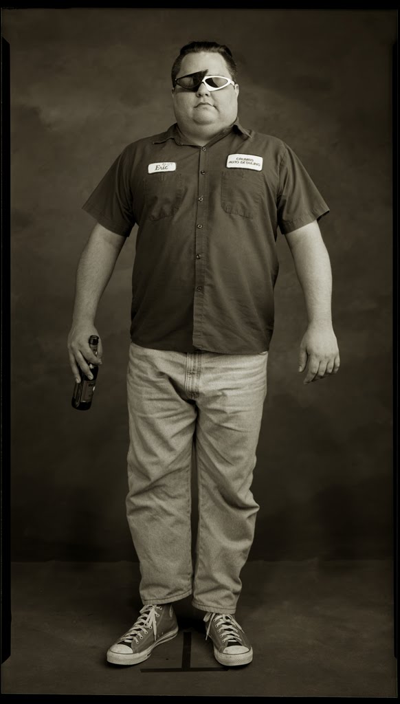
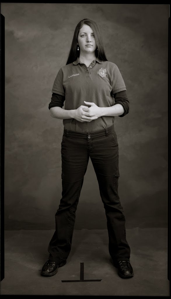
“Journey to Manitowoc, Wisconsin and stand on the black tape line on our studio floor. We expose hand-cut sheets of 2 ASA orthochromatic film, a smooth-grained film similar to what was used 100 years ago to make postcard negatives. The exposure is made with a large silver reflector and strobes to replicate the traditional pre-electric daylight studio. Thus there is little depth-of-field and little space in the narrow vertical postcard format frame. Any change of posture or stance effects the composition and focus due to the large aperture. The film is hand-processed and proofed in our darkroom. We contact print the selected negative in palladium hand-coated on Bergger Cotton 320 gram, then exposed by UV light for minutes to hours. There is no retouching. After processing through a series of chemical baths, the print air dries. Realizing the negatives using these processes deliberately critiques the meaning of realizing the lowliest, democratic folk photographic form–the real photo postcard–using the most extravagant photographic “fine art” materials still available in the 21st century.


“We mail one postcard-size print (5.5″x3.25”) to each person we photograph. A handwritten note on the back of each print completes our exchange with the individual. The postcard print migrates to the person’s specific geographic location–often far away from our studio. The small, dark objects are stamped, imprinted, manipulated by postal machines. Each postcard is delivered by the hand of an unknown postal worker: Mail Art in a time when the mail itself seems like a doomed information delivery system that goes back to the 18th-century. We wet scan the film negatives at high resolution and post .jpgs on [our] blog to produce a digital object viewable by a large audience. We also include hyperlinks to the web presence of each individual (if searchable) or a map of the place from which they traveled to come to our studio. The portraits replicate and turn up on facebook profiles and elsewhere.


“Deciding the time is right to be photographed is an aspect of collaboration not often critiqued. There is always a reason, an occasion and impetus to commission a portrait and it is fraught with complexity and we know them well but have rarely taken the time to list them. Almost every commission portrait becomes evidence of coming to grips with: mortality, sentimentality, nostalgia, humility, utility, vanity, self-conception, identity, metaphysics and the overwhelming cultural compulsion to smile for the camera. All are encapsulated in an ephemeral performance of self standing on the black tape line in silent acknowledgment of the eventuality that we too, like the 100 year old nameless people in the real photo postcards we are also posting on our blog shall pass into anonymity.


“The project pays homage to the “real photo postcard” – a way for isolated people in small Midwestern towns to show-and-tell something about their existence to family and friends in far-away places a century ago via the mail. Mail was delivered several times a day and a postcard was an easy way to dispatch a message within the city, to the next town or across the country. The post office was just about all there was. The new-fangled telephone was just getting started. Thus the post office provided the earliest and most accessible “efficient communication network” bringing information quick-and-easy to rural areas. The postcard provided a brief line of news and a photograph, a format that continues to this day in the guise of facebook and the culture of sharing mania now part of our everyday life. A photograph on the front with a personalized, handwritten message on the back could be mailed for a penny. Postcards traversed space and time more efficiently than any other communication technology of the period. We’ve been accumulating early-20th century RPPC studio portraits (circa 1904-1930). Viewed en masse, they form a typology of humanity betraying aspects of class and social status, gender construction and fashion sense, access to manufactured goods and services, mobility and world view. Additionally, the monochromatic abstraction of the person standing before the camera becomes a melancholy document reflecting the subtleties of gesture, clothing or prop choice and nuance of facial expression. Contemporary viewers are given insight into the social decorum and fashion their counterparts a century ago if they pause to take the time. The full-length portraits, disembodied from their own history, were typically made by anonymous photographers in small towns sometimes itinerant. Only rarely is the subject identified and then only with a handwritten note on the backside often in pencil or fountain pen. The old anonymous postcard portraits are free-floating fragments turning up at estate sales, rummage sales, thrift stores and vintage stores, examples of a form that connects to an ongoing cultural effort, an evolving tradition, to record the individual. They are printed on manufactured silver gelatin paper with a preprinted “post card” back. We scan the old cards we collect and post them on the blog juxtaposing them with contemporary individuals as a meditation on time and space. From gods and goddesses to saints and kings displayed on cave, castle, cathedral or museum walls to the recent sassy arms-length self-portraits routinely posted on flickr, facebook and myspace, the early 20th-century postcards survive as fragile paper monuments from a technological moment when photographic postcards of individuals were made by the millions. They survive in a continuum of portrayals in all media reflecting the existence of specific individuals at specific times existing in specific places.”


See and learn a lot more about RPPC: http://realphotopostcardsurveyproject.blogspot.com/http://realphotopostcardsurveyproject.blogspot.com/
(Thanks, Vicky.)

Dozens of Ph.Ds rode the rails to River North today, another perfect day in the Perfect City, to look at the effects of light on sensitized surfaces. Herewith, be nourished and piqued by these observations:
Ann Marie: “The photographer I found most inspiring today was Keith Carter, I think his work is meant to evoke memories or things you’ve previously imagined. His photos have an amazing ethereal and airy quality about them that makes you take notice and find your own meaning in them. I don’t want to say you get lost in the images, rather, your mind becomes extremely involved with it, almost creating your own alternate universe or back story. Some artists may feel limited only using one medium, but I feel that Carter is able to manipulate and tweak the process in a unique way that is completely appropriate.
The artist whose work I thought was most relevant to mine was Kevin Malella. Not that my work can even compare to his, it’s just that I noticed in his landscapes that there’s a repetition of shapes that reminds me of the geometric patterns in my photos. I think this work is perceived more elegantly than my own because of his attention to detail and composition, which I find engaging and individual.”
Emma: “The work we viewed today that I enjoyed most was that of Guillermo Srodek-Hart. His use of lighting, along with his tricky method of making it look like such pleasing light was coming from fluorescents, helped to better show off his eclectic subject matter. Speaking of the subject matter, this component of his work is what makes it eye-catching. Photographing generally disorganized little shops filled with random items helps the pictures to keep attention for longer than the average piece. Looking at these prints is like playing a game of I-Spy, trying to see what one can find on the lopsided shelves. The fact that these prints were in color definitely added to the overall effect, distinguishing between objects and adding to the mish-mashed quality of the photos.
While this particular artist’s work isn’t particular relevant to mine, I aspire to it. The artist whose work is most relevant to my own would be Keith Carter, mostly due to the fact that it is black and white and of smaller size than the other artists we viewed. His attention to the making of the print is pretty darn impressive and very intentional.”
Kalah: “On our trip today, I found one photographer, not on our list, that stuck in my mind all day. Lauren E. Simonutti’s work was, for me, memorable. I saw many elements of her photography as something I would strive for. In “The Devil’s Alphabet,” there is a darkness that makes you feel both intruiged and haunted. Most of the prints had tight framing, and that in itself was powerful because you are forced to look at every line, shape, and body part that might appear. I also enjoyed the rawness she brought. She was able to capture a state of mind that leaves the viewer interested in the meaning behind the print. I think what she was trying to show through these photographs is a helpless and gothic state of mind. That is where the rawness comes in. Being helpless and changing is putting yourself out there, and I think she did achieve that. Her use of line and angle are other elements that drew me in because you, again, have to look harder to determine a meaning behind them. The photograph, “Hollow,” was a favorite of mine (check it out!) because of the specific use of line and angle.
Another photographer i found interesting was Kevin Malella. His work was interesting becasue he achieved a specific emotion with each piece. That both impressed me and surprised me. When I first saw his work, i was very close, and I did not get much from it. As i backed away, I found i enjoyed it more because, as a panaramic piece, I could take it all in. “The Docks” put his work in view for me, because it automatically caught my eye and gave me that feeling of a cold, early winter morning. The lines, which seemed to be evident in many of his pieces in the gallery, set up a path to follow to be able to focus on more of the piece rather than in sections.”


All in all, a wonderful day in the city!” http://www.edelmangallery.com/exhibitions/2010/simonutti/simonuttishow2009_DA.htm
Brennan: “Keith Carter’s super low apertures really lit up my day today. He has something he is set on showing you and it is all in the small details that lie in focus. A simple image is made abstract when put almost entirely out of focus, and it allows the viewer’s mind to wander and think about what might be going on in the image. His portrayal of people seems to be in the actual moment it occurred, which makes you feel like you got a lucky glimpse of the action. Most of his images were printed full frame and it is nice to see that because it shows you how important framing the scene is before you take the picture. What makes this work more elegant than some of our own is that, though the images look spontaneous, they also feel very planned out, as though they were perceived before he took them.
Guillermo Srodek-Hart’s images had really outstanding lighting, especially considering most of them were taken indoors. The images were packed with objects and it almost feels like they attack you but the best kind of attack where everyone is excited and no one gets hurt.”
Susan: “The simplicity, yet extreme depth to Keith Carter’s work really stood out to me. I was able to see the captured the joys and hardships of human life within his photographs. I particularly was drawn to the provocative nature of each image and the story that could be told through the piece. He prints in a way that the black and white doesn’t drown out the happiness of the image, if that’s what it is meant to portray.
Shooting, I try to find simple things in life in order to capture things people might pass up or not notice. This is incredibly present in Keith Carter’s work as well as Guillermo Srodek-Hart’s work and Kevin Malella. Any of my work is not even comparable to these artists. I admire their abilities. Each of the photographers we looked at were able to maintain elements and principles of design though continue to do work that they wish and remain inspiring to others.”

Zach: “Each photographer we saw showed what they wanted to portray to the viewer in a great way. It was clear what each artist was focusing on, and in that choice they also made each piece stand out from another, yet they all flowed so well as a whole. Photographer Keith Carter caught my eye more than the others, as I think he did for pretty much everyone on the trip. Not to say the others are bad, I just think he was more relatable to the work of most people in the class. His work is not very relevant to my own, but the way he has a lot of things in and out of focus I think is something I notice in many of my pictures, and definitely something I want to work more towards. It’s very appealing for me to show various emotions. Keith’s work is by far more elegant than my own; myself, I am still not sure what exactly I am working towards, which makes it challenging shooting because I am not always trying to get one object, person, reason, or point of view across. In his work, he shows such strong passion and love in what he does, and pinpoints exactly his themes and ideas, making everything easy to understand and perceive.”

Kulsoom: “Keith Carter’s photographs from “Seen and Unseen” tested the limits of a photographer’s talents by allowing focus to be used as an illusion. What cannot be seen in these photographs is exactly what Carter didn’t want us to see. The intention is clearly shown and the process is not hidden. The photograph that most caught my eye was “Equestrienne”. This particular photograph had the ability to create wonder in each person who came across it. Each photograph in the series has a “seen and unseen” element. This one focuses on the eyes of what appears to be a young girl. Her eyes are cold and familiar, which makes this piece so impactful. The rest of the image is mostly distorted, but you catch yourself staring into her eyes, those that seem to follow you. Her emotionless expression, from what can be seen, further draws you into what her world may be like.”
Maggie: “Keith Carter’s work in “Seen and Unseen” combined both great concept and great execution (expected, if you are showing in galleries). There was always deep contrast in his pieces. Conceptually, the photos created scenes of contrast. An example of this was the photo of the old African-American man, who was rough and tired, with the young and delicate kittens. This was my favorite of the collection. He also stylized with great contrast by either using a specific focus surrounded by blur or deep blacks next to bright whites. The use of B/W was very appropriate in my opinion. B/W allows the viewer to focus on shape and composition.”
(Refer to https://photodevoto.wordpress.com/2010/04/08/where-were-going/ in order to see some of the work mentioned.)
(Cellphone pic, atop, by S. Pappas)
Photographer and attorney Bert Krages has written a clear overview of the legal issues that could arise on, say, a field trip. He offers it as a pdf, as does the American Civil Liberties Union provide their own broader version: the Bust Card. Read ’em and don’t weep: other nations are not so friendly to shooters of film & platers with pixels (see the last url, below). Here are excerpts from Krages’s pages:
“The general rule in the United States is that anyone may take photographs of whatever they want when they are in a public place or places where they have permission to take photographs. Absent a specific legal prohibition such as a statute or ordinance, you are legally entitled to take photographs. Examples of places that are traditionally considered public are streets, sidewalks, and public parks. Property owners may legally prohibit photography on their premises but have no right to prohibit others from photographing their property from other locations.
“Taking a photograph is not a terrorist act nor can a business legitimately assert that taking a photograph of a subject in public view infringes on its trade secrets. On occasion, law enforcement officers may object to photography but most understand that people have the right to take photographs and do not interfere with photographers. They do have the right to keep you away from areas where you may impede their activities or endanger safety. However, they do not have the legal right to prohibit you from taking photographs from other locations.
“Absent a court order, private parties have no right to confiscate your film. Taking your film directly or indirectly by threatening to use force or call a law enforcement agency can constitute criminal offenses such as theft and coercion. You are under no obligation to explain the purpose of your photography nor do you have to disclose your identity except in states that require it upon request by a law enforcement officer.”
BTW, in the instance of the afore-imagined field trip, it’s a good idea to carry one’s student ID; Chicago has truancy officers.
http://www.krages.com/phoright.htm
http://www.aclu.org/files/pdfs/racialjustice/rp_bustcard_eng_20090929.pdf
http://action.aclu.org/site/DocServer/kyr_spanish.pdf?docID=186&cr=1
“If you’re a professional, you contribute to the profession,” he replies. “There is an underlying attitude for support, a pouring back of interest and thought. Musicians teach master classes. Doctors do research, write papers, give time to charity. The artist is a professional.
“If the art gives the artist life, then the artist in turn should give the art life. There has been a lack of understanding of this concept in photography. But you just can’t live an independent, selfish existence. You lose on it.”

-Ansel Easton Adams
On April 15, taxes behind us, next year’s Varsity Photo class (and most of this year’s roster) will travel via rail to the City of Big Tripods to see original work on exhibit. These jpegs on your screen just don’t cut it; the original prints will be seen as they were intended to be seen.

Guillermo Srodek-Hart

Kevin Malella

Karen Savage

Eugene Richards

Jon Fjortoft
Ten or fifteen years ago I began to get brochures in the mail from the Festival Musique Actuelle in Victoriaville (somewhere between Montreal and Quebec City); they must have profiled me as a likely attendee. It’s the wrong time of the year for a Huge School art teacher, so I hope the affair continues after I retire (like that’s gonna happen). Still, I know many of you would be interested in this annual festival of experimental and improvised music, which often includes jazz, so here are some highlights from this year’s schedule:
One hundred electronic Nabaztag bunnies in choir formation, lighting up, wiggling their ears, and playing back music following a sophisticated score inspired by Cage, Reich, Ligeti, and Nancarrow.
Montreal guitarist Sam Shalabi goes back to his Egyptian roots. Land of Kush is the large ensemble project where he rethinks Egyptian pop music in terms of experimental groove. Five singers and twenty musicians or so, with a blend of rock and Arab instruments.
Lydia Lunch, the queen of no-wave… sings/reads her sordid tales backed by the noise music of Strings of Consciousness’s Philippe Petit, who works with prepared sounds and turntable mistreatments.

Les Momies de Palerme, two young and mysterious ladies playing ghostly and ungraspable music – a blend of Gothic drone and ethereal songs.
Three Norwegians and a Frenchman… a gamelan-like soundworld.
Tanya Tagaq has reinvented traditional Inuit throat singing, turning it into something modern, experimental, and incredibly sensual… she delivers a performance where song meets improvisation, past meets present, and rock showmanship meets bold creativity.

Erick D’Orion: Six pianos from different eras are reacting to the impulses of unbalanced motors attached to their structures. The pianos transform into vibrating surfaces.
Composer and choirmaster Andre Pappathomas has enlisted the participation of local choirs to create a virtual choir of voices from Victoriaville. He met several singers and recorded them individually. These tracks have been assembled and orchestrated to compose “La vie mode d’emploi,” a never-heard-before sound installation set out right onto the bicycle trail, near the bandstand, where passers-by will be able to stroll around and, in some cases, recognize their own voices.
American free jazz legend Bill Dixon presents, for the first time ever on stage, his “Tapestries for Small Orchestra” project, an all-out exploration of the sonic capabilities of the trumpet. Music that is composed yet improvised, strictly laid out yet free, filled with people yet strangely open and roomy. (Includes Chicago trumpeter Rob Mazurek.)

“Man believes that he evolves advancing toward intelligence.
I believe the opposite.
Man finds his place by moving toward consciousness.”


